Thursday, August 28, 2014

Subj : 20th Century Design
Lect : Mr. Andrew Stiff
Task : Dadaism

Dadaism is a movement in art and literature based on deliberate irrationality and negation of traditional artist. As we cant see many artist express their feeling through art work same to dadaism the artist express their feeling and their perception through art either with drawing, collage or make sculpture. In dadaism they not care about the beautiful of the work but the meaning of the art that only the designer cant understand it.
We are ask to pick 6 things and put it in the box and we exchange the box with other person after that we are divided into a group that each group have two member and my partner is Alexis. So now we have 12 things and we must pick one topic as the issue for this project and our topic is TRANSGENDER. I want to show what is transgender in my project and my things is bracelets, chain, coin, soap, masking tape, wire, batteries, polystyrene cup, plastic bottle that has been cut, shell, plastic cup and tissue roll.

We just do a sketches for this project and we must relate the dadaism into our project. We take the Marcel Duchamp as our reference artist. We choose he  because of his photo that show he wearing the women cloth. It show the connection from our topic transgender because he  is man and wearing women cloth.

Other than that Marcel Duchamp also famous with their work name Fountain. He use the term that is ready-made for develop his idea. Same with us, we just use the things that we have to make the art about what is transgender.


LEARNING OUTCOMES


  • Dadaism is the art with no rule and we can do it as a place for us to express our feeling.

Digital Design task 2

Subj : Digital Design
Task 2 : Movie Sequence

We are ask to make a movie sequence from the story that we have choose from the first task. My story sequence is about Snow White and The Seven Dwarfs. I must using the software to design the character but after I think again about it I decided to use food as the character of for my movie sequence. I use flour for design the snow white and the prince character and I also use basil seeds to design the witch. I use food to design the character because in the story snow white the climax of the story is about apple. Therefor I using plate and the food for this movie sequence. I also use software like photoshop and illustrator to edit picture of the seven dwarf, the castle, the mirror, the horse, and the seven dwarf house. Other than that I also paint on the plate. This is my work :
 

I find that not easy to make this task because I need to really understand the story and identify the plot of the story also I need to think what kind of movie sequence that I want to make. So this is my final work for this task. 
At first I want to make this movie sequence into a puzzle because I think this story is about a life story. A life story is not complete if some of the part of the story is missing just like the puzzle if some part of the puzzle missing so the puzzle is not complete. But actually this story is more to love story and the main thing in this story is the apple so I think why not I make this movie  sequence on the  plate. 

LEARNING OUTCOME
  • Try to understand what medium and the things that we want to use to represent the story so it will give some effect to the audience when they look at our work. 

Wednesday, August 27, 2014

Design Studio Conceptualization.

Subj : Design Studio Conceptualization 
Task 3 : Design Process Using Visualization Methods

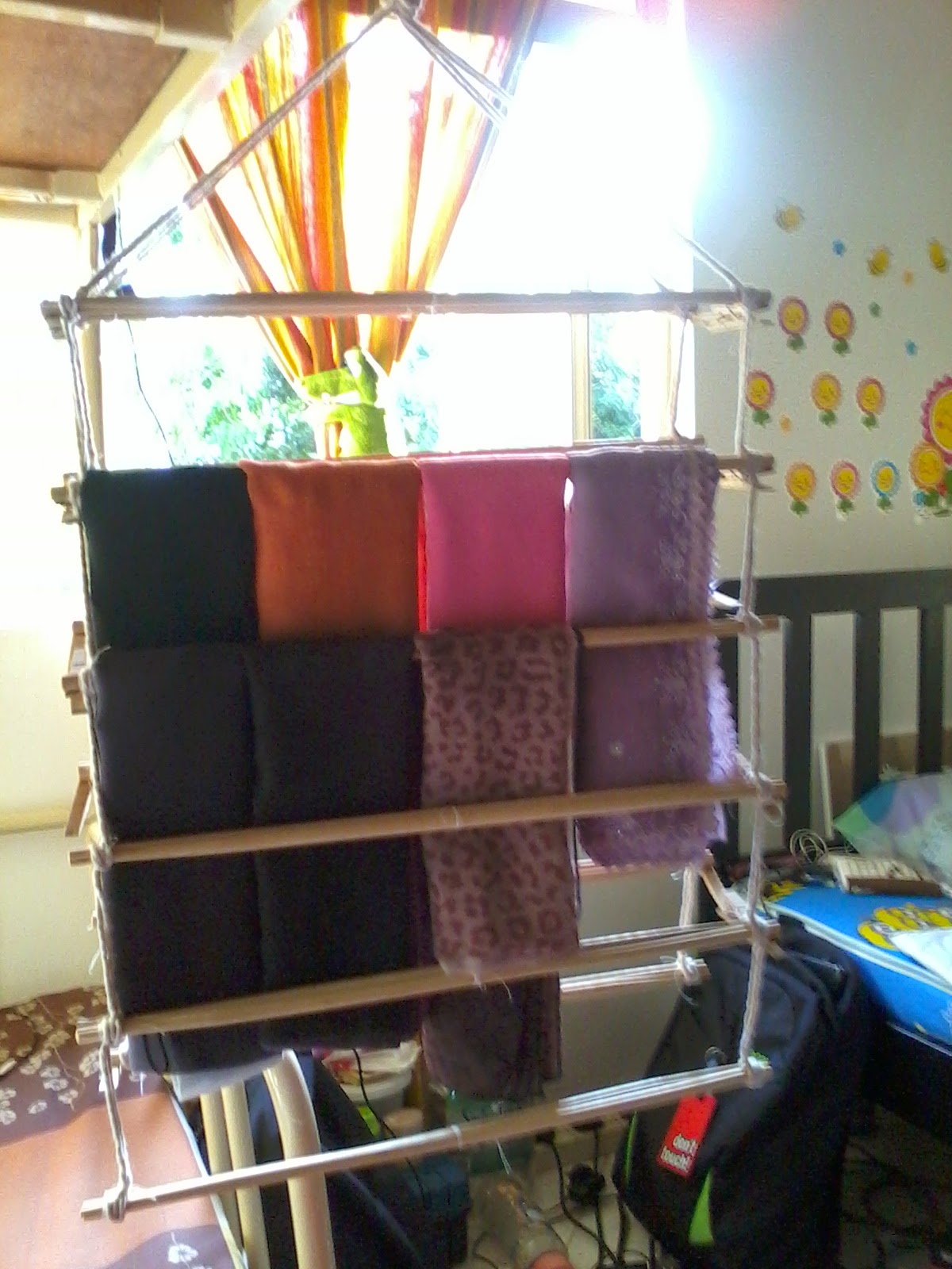
After the last task that we have make the form now we must make the form with the function. We can use the same object or replace it with the other thing. I decided to take two object from the last task it is a chopstick and the cloth pick. At first I want to make a basket but after that I think that I have a problem to manage my scarf. I have to many scarf and the hanger that I use for hanging my scarf are not enough space and I have to hang it double and it make me difficult to choose the scarf when I want to use it. So I make a decision to design a new hanger for my scarf that is easy to hanging and have many space so I can hang all my scarf. At first I use the small chopstick and I find out that when I combine the two chopstick and hang the scarf it will band and it not strong to hang many scarf on it.

The two chopstick that I glue it together
After that I go and find the other chopstick that is long and strong to cover the scarf. This is the result for my project :


I make the hanger have two side, one row can cover 4 scarf and I make it 6 row for each side. I use the hook at the upper of the row to make it easy to hang inside the cardboard. This hanger also easy to turn around and easy to bring anywhere we want to go. It can be separate by two and took a small space to keep it. To make it more nice we also can color it with the nice and suitable color. I use the cloth pick at the side of the chopstick because easy to take off if we want to bring it anywhere. I choose this shape because it will easy to manage compare to the circle shape. Other than easy to manage the scarf also will look nice without many wrinkles.

LEARNING OUTCOME

  • As a designer we should design something that will solve the problem and make the work more easier.
  • When we face the problem try to solve it by design something not run from the problem.
  • When we design something try to make it useful and easy to handle. 

Design Studio Conceptualization

Subj : Design Studio Conceptualization 
Task 3 : Design Process Using Visualization Method

We are ask to chose at less 5 object and we must use it to make a form. For this task I chose tooth pick, cloth pick, and chopstick. I try use tooth pick to make a form. I make a triangle and square shape from the tooth pick and this is my work:


I make the side cross to each other to make it look nice. After that I try to lap it with the same shape but difference position it look like a tower and look beautiful. I also try to make from the triangle to become a star. The star can stand we can put another triangle on it to make another form. After that I try to make a square shape using a cloth pick. It look too simple so I decided to combine it with the triangle from the tooth pick that I have make and put some chopstick at the side of it and this is how it look :
the look from the up

The look from in front 
The look from the back

This is how it look when I look at it carefully it look like the king chair. The triangle at the side of the cloth pick make it look nice. I use cloth pick because it easy to take off and we can form it into another form.

LEARNING OUTCOME
  • Try as many as you can to do an experiment to the object that you have choose. Sometime the result for the experiment we cannot predict and it will give you a surprise outcome.
  • For me it not a easy task because for this task I need to do something without think the function.
  • I learnt that sometime the form come first and than followed by the function. 


Sunday, August 24, 2014

Critical thinking [task 2]

Subj : Critical Thinking
Task 2 : Word As Visual Expression

From 5 word that we have choose, we need to use illustrator and  make the word reflect the meaning of it's.
The first one is the words SUAVE. the meaning of word suave is someone who is charming, polite and elegant, but may be insincere. This is the  mind map that I have done:


And this is the word that I made from the illustrator:


I use the century gothic as the typography and put the icon like a tie at the latter 'u' to make it look like a man suit it represent the elegant of the suit.

Second word is CHEERFUL. The meaning of the words cheerful is a person or thing that bring joy, humor or good spirits and also causing happiness by it's nature or appearance. This is the mind map for the word cheerful:


Cheerful that I made from illustrator:


The typography for this word is Jokerman Regular. I use this type of typo because the letter look cheer.and I also make the letter not in the same leading to make it look more fun. I make one of the letter 'e' reflected to another side to make it look like two people were laughing at each other.

The third word is CREATIVE. The meaning of the word creative is the person who have the ability to invent and develop original ideas, especially in the art. The mind map for this word:


Creative word that I made from the illustrator:


The typography for this word is Curlz MT. I use this type of typo because it look artistic with the rounded line at the letter. I also make the letter 't' look like the added symbol it mean the positive thinking to make the creative art.

The fourth word is INTELLIGENT. Intelligent mean a person that has the ability to think,understand, and learn things quickly well and this is the mind map for this word:


And this is the word that I made from illustrator:


I use the vijaya regular typo for this word because the it look smart and like an educated letter. The use of exclamation mark as the letter 'i' like a idea that the intelligent person always need to think to solve a problem. The use of the capital letter 'T' is to make the word tell look clear, the intelligent person must have the ability to tell other person about what they think.

The fifth word is FRIENDLY. Friendly mean someone who behave in a pleasant, kind way, and like to be with other people. This is the mind map for the word friendly:


And this is from the illustrator:


For this word I use Pristina regular as the typo because this typo look simple and intimate. I make the letter close with each other because friendly mean get close with every friend that we have around us. I make the letter 'L' capital because want to show the word mean very friendly.

LEARNING OUTCOME
  • Every single typo have a different character and we need to understand it to make the message that we want to deliver clear to the audience.
  • We also need to understand clearly about the meaning of the word so that easy for us to make decision which typo that we should use for the word.
  • The arrangement of the letter also play the role in deliver the message to the audience. It also can make the meaning of the word look more clear.   
Subj : Critical Thinking
Activity In The Class

In that day we need to go outside of the class and need to find two item one is the natural thing and another one is human made. I choose two thing one is the leaf and another one is hand phone.
After we has pick two item we need to do the transformation of the two item. My item is leaf and the phone so I need to draw the transformation from the leaf to became the phone.
This activity quite fun and interesting because we need to think and draw the transformation step by step in one hour and this is what I have done :

LEARNING OUTCOME

  • Learnt to look deeply the object like the shape, the color, the texture and try to relate it to another thing
  • Sketch the idea to make it easy to develop.
  • Think outside the box. 

Saturday, August 16, 2014

Critical Thinking [task 2 in prosess]

Subj : Critical Thinking
Task 2 : Word as Visual Expression

From 10 words that we have list down we need to pick 5 words that really represent our self, so this is the words that I have pick :

  1. Suave 
  2. Cheerful
  3. Creative
  4. Intelligent 
  5. Friendly
From this 5 words we need to experiment on the typography that will show the meaning of the words. We need to use the software like illustrator to make this task. Visual imaginary are not allowed in this task. 

LEARNING OUTCOME
  • Apply all out our skill in illustrator and also learn deeply about the software.
  • Learnt to understand the word clearly.
  • Do a lot of mind map that will help to develop more the words.

critical thinking [task 2 word as visual expression]

Subj : Critical Thinking
Task 2 : Word As Visual Expression

We are require to list down 10 character about our self and all the character about our self are from our friend. This is the 10 character that I get from the discussion :

  1. Cheerful
  2. Religious
  3. Suave
  4. Honest
  5. Intelligent
  6. Dependable
  7. Friendly
  8. Gregarious
  9. Creative
  10. Resilience
THE MEANING OF THIS 10 WORDS

1. CHEERFUL

  • A person or thing that bring joy, humor or good spirits
  • Noticeably happy and optimistic
  • Causing happiness by it's nature or appearance
2. RELIGIOUS

  • Things that are connected with religion or with one particular religion
  • Someone who is religious has a strong belief in a god
3. SUAVE

  • Someone who is charming, polite, and elegant, but may be insincere
 4. HONEST

  • Someone that they always tell the truth, and do not try to deceive people or break the law
  • Tell the complete truth or give your sincere opinion, even if this is not very pleasant
5. INTELLIGENT

  • A person that has the ability to think, understand, and learn things quickly and well
  • The ability to think and understand instead of doing things automatically or by instinct
6. DEPENDABLE

  • Someone that you approve of them because you feel that you can be sure that they will always act consistently or sensibly or do what you need them to do
7. FRIENDLY

  • Someone who behave in a pleasant, kind way, and like to be with other people 
8. GREGARIOUS 

  • Someone who is enjoys with other people
9. CREATIVE

  • A person has the ability to invent and develop original ideas, especially in the art
  • Inventing and making of new kind of thing 
  • You use something in a new way that produces interesting and unusual results
10. RESILIENCE

  • The ability to become strong, healthy, or successful again after something bad happen
  • When you make your mistake in public you will learnt that they are mistake and in being corrected you will grow.
  • It also working from your strength and cultivating in all matters of life.
From here I learn to understand and know all my friend well and also know what their impression about me.


Tuesday, August 12, 2014

Method Of Investigation

Subj : Method Of Investigation
Lect : Miss Nadyra Bashir
Task 3 : Investigate Good Source For Good Outcome

For this task we are require to pick 10 book that relate to the our project in subject design studio conceptualization and this is the list of the book that I pick :

1. Tittle : Architectural Design : Design For The Third Age: Architecture Defined for A generation of Active    Agers' AD
Author: Farvelly, Lorraine
Publisher : Wiley

2. Tittle : Critical Architecture and Contemporary Culture
Author : Lillyman, William.J Moriarty, Harilyn.F Neuman, David.J
Publisher : Oxford University press, incorporated

3. Tittle : Reconstructing Architecture : Critical Discourses and Social Practices
Author : Dutton, Thomas.A Mann, Lisa.H
Publisher : University Of Minnesota press

4. Tittle : Methodology for Product Development in Architecture
Author : Eekhout,M.
Publisher : IOS press

5. Tittle : World's Greatest Architect : Making, Meaning, and network culture
Author : Mitchell, William.J
Publisher : MIT Press

6. Tittle : Impression of Japanese Architecture
Author : Cram, Ralph Adams Locher, Mira
Publisher : Tuttle Publishing

7. Tittle : Narrow House : New Directions in Efficient Design
Author : Friedman, Avi
Publisher : Pinceton Architectural press

8. Tittle : Reading Architecture : A Visual Lexicon
Author : Hopkins, Owen
Publisher : Laurence King Publishing

9. Tittle : Wonder Wood : A Favorite Material for Design, Architecture and art
Author : Glasner, Barbara Ott, Stephen
Publisher : Birkhauser

10. Tittle : Model Making
Author : Werner, Megan
Publisher : Princeton Architectural press

11. Tittle : Architectural model : Construction Techniques (2nd edition)
Author : Knoll, Wolfgang Hechinger, Martin
Publisher : J.Ross Publishing Inc

12.Tittle : Free Form Structural Design
Author : Veltkamp,M
Publisher : IOS press

Tuesday, August 5, 2014

Design Studio Conceptualization

Subj : Design Studio Conceptualization
Task 2 : Process Book

Create a structure by utilizing such units in an interlocking manner.
We need to take picture as many as we can and than we need to use the picture as a mark making. After that we need to edit the picture using the software like photo shop and illustrator.
This is some picture that I take as an example of this task.
Mark making is a effect from the thing like pen on paper, water color on paper, scratching mark in plaster, or anything that leaves a mark on the page are call mark making.

I must create my own mark making by using anything. I have try to use the Chinese brush to make a mark making, and this is the result 


From here we can see the color of the ink went we use the difference material. Some of the mark making in this picture are made by brush and some are made by the Chinese brush. we also can see the difference effect when we use more water or less water in the color portion.

This is the mark making that I made using the illustrator. From here we can see the movement of the object
Picture 1 : mark making using software

Picture 2 : This is the mark making that I made by using the marker pen

This idea I get from the concept illusion, the repeating of the same color make it look like the illusion and the using of the difference color make it look like a moving object. Other than that The using of the same size of line but from difference direction and using the positive and the negative color. The triangle shape make it look contrast because it have a difference shape and difference color.


  For this mark making I use the color from the tube and put it on the plastic and put the paper on it. The mix of the color look nice and I use 3 base color to make it it is yellow, red, and blue. From here we can see the color mixer and contrast of the color.


 Other than that I also use mark Technic by using my finger tip.  


Lastly for this mark making I use the color pencil to make a feather. The combination of many thin line make the feather look soft. The line at the middle of the feather make it look symmetry.  

Learning Outcome
= All the thing around us we can use as a mark making.
= Difference material can produce the difference outcome some time it will look nice 

Sunday, August 3, 2014


Subj : Digital Design
Lect : Mr. Kamarul
Task 1 : Create A Movie Poster


This task wants me to pick one movie and make a new poster for the movie so I pick the snow white and the seven dwarfs’ movie.


This story is about a beautiful girl, Snow White, takes refuge in the forest in the house of seven dwarfs to hide from her stepmother, the wicked Queen. The Queen is jealous because she wants to be known as "the fairest in the land," and Snow White's beauty surpasses her own. The dwarfs grow to love their unexpected visitor, who cleans their house and cooks their meals. But one day while the dwarfs are at their diamond mine, the Queen arrives at the cottage disguised as an old peddler woman and persuades Snow White to bite into a poisoned apple. The dwarfs, warned by the forest animals, rush home to chase the witch away, but they are too late to save Snow White from the poisoned apple. They place her in a glass coffin in the woods and mourn for her. The Prince, who has fallen in love with Snow White, happens by and awakens her from the wicked Queen's deathlike spell with "love's first kiss." 

I think to use the apple as the main object for the movie because the apple is the cause snow white fall sleep and this is the important thing in the story. The apple also represent as a weapon to kill the snow white.

This is my first poster:


From this poster it look like too simple and does not have any story from the poster so I put some smoke to make it look like poisonous. Then I notice that the taglines are not suitable with the image of apple so I need to find a new tagline.


When everything finish I print the poster and it look like something are lack. So I do it again I find what is the important thing in the story and try to summary all in one poster. I decide to make a new poster with the image of apple and the snow.

I choose snow because the snows white are born in the snow and the apples are the cause of snow white fall sleep. I also change the tagline. At first I want to make it in black and white, but it look like the image of the apple not clearer and the name of the actor are too big and the position are not suitable. Finally I decide to rearrange it back and this is the final poster of the snow white.


Learning outcome

Before do something we need to plan everything and the draft is the important thing that we need to do. When we have the draft and we have plan the work will be easier.

Critical Thinking


Subj : Critical Thinking
Task 1 : Think Hard


Create a set of alphabets on an A2 size piece of paper or card without using any mark making.

 I need to choose a word that will represent myself so I choose the word ‘VERSATILE’. Versatile mean have a many difference skill. I use the origami technic to form alphabets. I have to identify which part that I must fold and which part that I must cut also which part that I must keep to make it look like an alphabets.

After I get the structure of the alphabet I start using color to make the word look clearer and this is my first experiment.


 From this experiment I notice that the color was dull and cannot see the word that I make. So I make a new one this time I use the white background and I color the word with difference color to make it look more attractive. Other than that I use difference color because it suitable with the word ‘VERSATILE’.


After I finish everything I notice that the backgrounds are messy so I decide to make some mark making to cover the messy. I use the technic spatter on the wet paper. At first it looks nice but maybe I put to many water and then the color mix and it became like this:


I use the origami video in you tube as my reference for making this alphabets.

Learning outcomes

From here I learn design cannot be expected because some time when the incident happen in design it will give you an expected result and it will give a better result.