Subj : Critical Thinking
Task 3 : Navigate Me!
In this task we are require to do outside assignment, we need to go some place and analyst the sound all the way to the place and I choose the sound from here to the Caltex. I find out that some of the sound not easy to interpret such as like the sound of village, the sound of petrol station, and the sound of the bush. Therefore I search at youtube to listen some of the sound that I cannot interpret. Other than that we also must think what type of typo that suitable to use for represent the sound of that place such as the sound of transport and the sound of the car hon. Other than that I also play with the color to the font like the color of red for the word 'poonn' this sound of car hon. I use red because it like a warning sound other than that I also use the color of green to represent the mosque because green shows a Muslim.
Monday, September 1, 2014
Thursday, August 28, 2014
Subj : 20th Century Design
Lect : Mr. Andrew Stiff
Task : Dadaism
Dadaism is a movement in art and literature based on deliberate irrationality and negation of traditional artist. As we cant see many artist express their feeling through art work same to dadaism the artist express their feeling and their perception through art either with drawing, collage or make sculpture. In dadaism they not care about the beautiful of the work but the meaning of the art that only the designer cant understand it.
We are ask to pick 6 things and put it in the box and we exchange the box with other person after that we are divided into a group that each group have two member and my partner is Alexis. So now we have 12 things and we must pick one topic as the issue for this project and our topic is TRANSGENDER. I want to show what is transgender in my project and my things is bracelets, chain, coin, soap, masking tape, wire, batteries, polystyrene cup, plastic bottle that has been cut, shell, plastic cup and tissue roll.
We just do a sketches for this project and we must relate the dadaism into our project. We take the Marcel Duchamp as our reference artist. We choose he because of his photo that show he wearing the women cloth. It show the connection from our topic transgender because he is man and wearing women cloth.
Other than that Marcel Duchamp also famous with their work name Fountain. He use the term that is ready-made for develop his idea. Same with us, we just use the things that we have to make the art about what is transgender.
LEARNING OUTCOMES
- Dadaism is the art with no rule and we can do it as a place for us to express our feeling.
Digital Design task 2
Subj : Digital Design
Task 2 : Movie Sequence
We are ask to make a movie sequence from the story that we have choose from the first task. My story sequence is about Snow White and The Seven Dwarfs. I must using the software to design the character but after I think again about it I decided to use food as the character of for my movie sequence. I use flour for design the snow white and the prince character and I also use basil seeds to design the witch. I use food to design the character because in the story snow white the climax of the story is about apple. Therefor I using plate and the food for this movie sequence. I also use software like photoshop and illustrator to edit picture of the seven dwarf, the castle, the mirror, the horse, and the seven dwarf house. Other than that I also paint on the plate. This is my work :
I find that not easy to make this task because I need to really understand the story and identify the plot of the story also I need to think what kind of movie sequence that I want to make. So this is my final work for this task.
At first I want to make this movie sequence into a puzzle because I think this story is about a life story. A life story is not complete if some of the part of the story is missing just like the puzzle if some part of the puzzle missing so the puzzle is not complete. But actually this story is more to love story and the main thing in this story is the apple so I think why not I make this movie sequence on the plate.
LEARNING OUTCOME
- Try to understand what medium and the things that we want to use to represent the story so it will give some effect to the audience when they look at our work.
Wednesday, August 27, 2014
Design Studio Conceptualization.
Subj : Design Studio Conceptualization
Task 3 : Design Process Using Visualization Methods
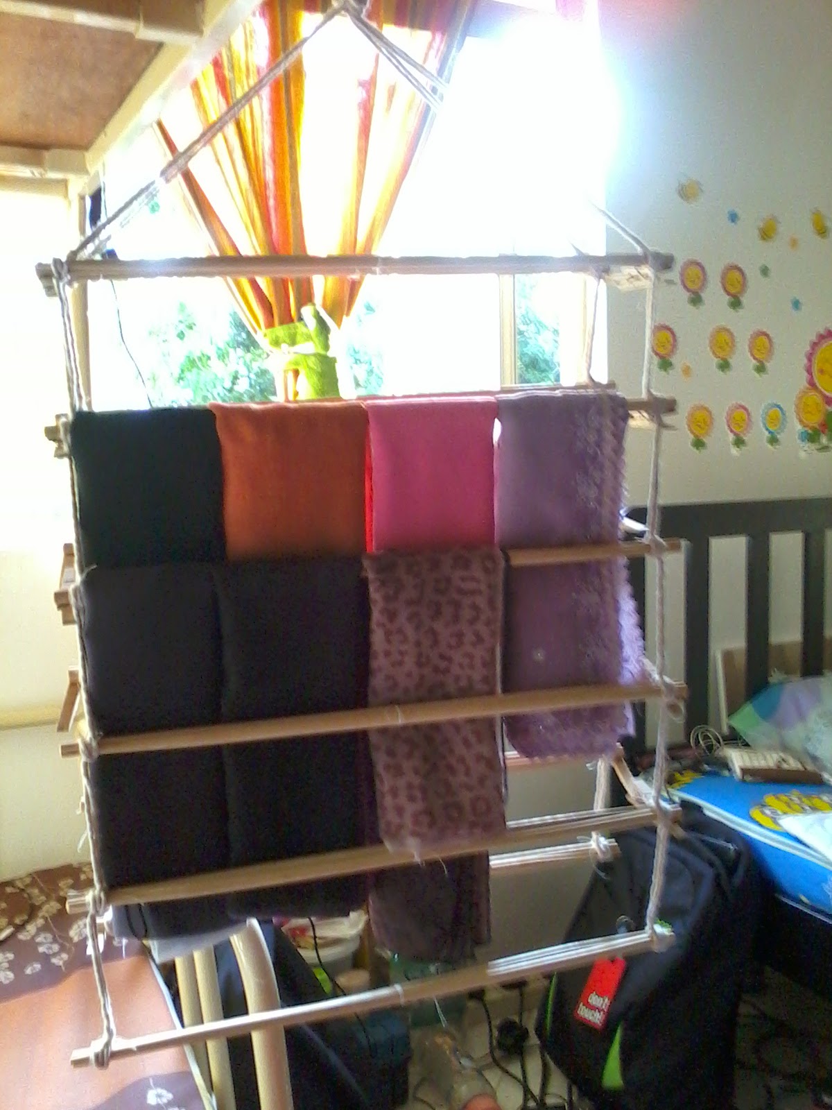
After the last task that we have make the form now we must make the form with the function. We can use the same object or replace it with the other thing. I decided to take two object from the last task it is a chopstick and the cloth pick. At first I want to make a basket but after that I think that I have a problem to manage my scarf. I have to many scarf and the hanger that I use for hanging my scarf are not enough space and I have to hang it double and it make me difficult to choose the scarf when I want to use it. So I make a decision to design a new hanger for my scarf that is easy to hanging and have many space so I can hang all my scarf. At first I use the small chopstick and I find out that when I combine the two chopstick and hang the scarf it will band and it not strong to hang many scarf on it.
After that I go and find the other chopstick that is long and strong to cover the scarf. This is the result for my project :
I make the hanger have two side, one row can cover 4 scarf and I make it 6 row for each side. I use the hook at the upper of the row to make it easy to hang inside the cardboard. This hanger also easy to turn around and easy to bring anywhere we want to go. It can be separate by two and took a small space to keep it. To make it more nice we also can color it with the nice and suitable color. I use the cloth pick at the side of the chopstick because easy to take off if we want to bring it anywhere. I choose this shape because it will easy to manage compare to the circle shape. Other than easy to manage the scarf also will look nice without many wrinkles.
LEARNING OUTCOME
Task 3 : Design Process Using Visualization Methods
After the last task that we have make the form now we must make the form with the function. We can use the same object or replace it with the other thing. I decided to take two object from the last task it is a chopstick and the cloth pick. At first I want to make a basket but after that I think that I have a problem to manage my scarf. I have to many scarf and the hanger that I use for hanging my scarf are not enough space and I have to hang it double and it make me difficult to choose the scarf when I want to use it. So I make a decision to design a new hanger for my scarf that is easy to hanging and have many space so I can hang all my scarf. At first I use the small chopstick and I find out that when I combine the two chopstick and hang the scarf it will band and it not strong to hang many scarf on it.
![]() |
| The two chopstick that I glue it together |
I make the hanger have two side, one row can cover 4 scarf and I make it 6 row for each side. I use the hook at the upper of the row to make it easy to hang inside the cardboard. This hanger also easy to turn around and easy to bring anywhere we want to go. It can be separate by two and took a small space to keep it. To make it more nice we also can color it with the nice and suitable color. I use the cloth pick at the side of the chopstick because easy to take off if we want to bring it anywhere. I choose this shape because it will easy to manage compare to the circle shape. Other than easy to manage the scarf also will look nice without many wrinkles.
LEARNING OUTCOME
- As a designer we should design something that will solve the problem and make the work more easier.
- When we face the problem try to solve it by design something not run from the problem.
- When we design something try to make it useful and easy to handle.
Design Studio Conceptualization
Task 3 : Design Process Using Visualization Method
We are ask to chose at less 5 object and we must use it to make a form. For this task I chose tooth pick, cloth pick, and chopstick. I try use tooth pick to make a form. I make a triangle and square shape from the tooth pick and this is my work:
I make the side cross to each other to make it look nice. After that I try to lap it with the same shape but difference position it look like a tower and look beautiful. I also try to make from the triangle to become a star. The star can stand we can put another triangle on it to make another form. After that I try to make a square shape using a cloth pick. It look too simple so I decided to combine it with the triangle from the tooth pick that I have make and put some chopstick at the side of it and this is how it look :
![]() |
| the look from the up |
![]() |
| The look from in front |
![]() |
| The look from the back |
This is how it look when I look at it carefully it look like the king chair. The triangle at the side of the cloth pick make it look nice. I use cloth pick because it easy to take off and we can form it into another form.
LEARNING OUTCOME
- Try as many as you can to do an experiment to the object that you have choose. Sometime the result for the experiment we cannot predict and it will give you a surprise outcome.
- For me it not a easy task because for this task I need to do something without think the function.
- I learnt that sometime the form come first and than followed by the function.
Sunday, August 24, 2014
Critical thinking [task 2]
Subj : Critical Thinking
Task 2 : Word As Visual Expression
From 5 word that we have choose, we need to use illustrator and make the word reflect the meaning of it's.
The first one is the words SUAVE. the meaning of word suave is someone who is charming, polite and elegant, but may be insincere. This is the mind map that I have done:
And this is the word that I made from the illustrator:
I use the century gothic as the typography and put the icon like a tie at the latter 'u' to make it look like a man suit it represent the elegant of the suit.
Second word is CHEERFUL. The meaning of the words cheerful is a person or thing that bring joy, humor or good spirits and also causing happiness by it's nature or appearance. This is the mind map for the word cheerful:
Cheerful that I made from illustrator:
Task 2 : Word As Visual Expression
From 5 word that we have choose, we need to use illustrator and make the word reflect the meaning of it's.
The first one is the words SUAVE. the meaning of word suave is someone who is charming, polite and elegant, but may be insincere. This is the mind map that I have done:
And this is the word that I made from the illustrator:
Second word is CHEERFUL. The meaning of the words cheerful is a person or thing that bring joy, humor or good spirits and also causing happiness by it's nature or appearance. This is the mind map for the word cheerful:
Cheerful that I made from illustrator:
The typography for this word is Jokerman Regular. I use this type of typo because the letter look cheer.and I also make the letter not in the same leading to make it look more fun. I make one of the letter 'e' reflected to another side to make it look like two people were laughing at each other.
The third word is CREATIVE. The meaning of the word creative is the person who have the ability to invent and develop original ideas, especially in the art. The mind map for this word:
Creative word that I made from the illustrator:
The typography for this word is Curlz MT. I use this type of typo because it look artistic with the rounded line at the letter. I also make the letter 't' look like the added symbol it mean the positive thinking to make the creative art.
The fourth word is INTELLIGENT. Intelligent mean a person that has the ability to think,understand, and learn things quickly well and this is the mind map for this word:
And this is the word that I made from illustrator:
I use the vijaya regular typo for this word because the it look smart and like an educated letter. The use of exclamation mark as the letter 'i' like a idea that the intelligent person always need to think to solve a problem. The use of the capital letter 'T' is to make the word tell look clear, the intelligent person must have the ability to tell other person about what they think.
The fifth word is FRIENDLY. Friendly mean someone who behave in a pleasant, kind way, and like to be with other people. This is the mind map for the word friendly:
And this is from the illustrator:
For this word I use Pristina regular as the typo because this typo look simple and intimate. I make the letter close with each other because friendly mean get close with every friend that we have around us. I make the letter 'L' capital because want to show the word mean very friendly.
LEARNING OUTCOME
- Every single typo have a different character and we need to understand it to make the message that we want to deliver clear to the audience.
- We also need to understand clearly about the meaning of the word so that easy for us to make decision which typo that we should use for the word.
- The arrangement of the letter also play the role in deliver the message to the audience. It also can make the meaning of the word look more clear.
Subj : Critical Thinking
Activity In The Class
In that day we need to go outside of the class and need to find two item one is the natural thing and another one is human made. I choose two thing one is the leaf and another one is hand phone.
After we has pick two item we need to do the transformation of the two item. My item is leaf and the phone so I need to draw the transformation from the leaf to became the phone.
This activity quite fun and interesting because we need to think and draw the transformation step by step in one hour and this is what I have done :
LEARNING OUTCOME
- Learnt to look deeply the object like the shape, the color, the texture and try to relate it to another thing
- Sketch the idea to make it easy to develop.
- Think outside the box.
Subscribe to:
Posts (Atom)